
POP'D KERNS
BRAND REPOSITION

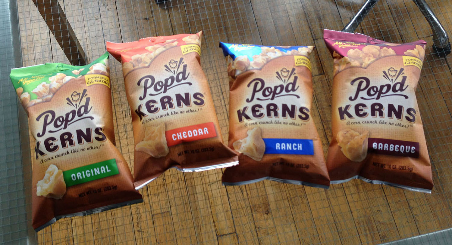


MAKING A BRAND POP - We were asked to create a brand identity and package design that reflected the fun, healthy and explosive character of the product. The natural tones of the burlap background and the matte finish of the bag positions the product as a healthy snack option. In contrast, the vibrant colour coding attracts the consumer’s eye, differentiates between flavours and promises a bold flavour experience.