REXALL BRANDS
PACKAGE DESIGN
FROM OUCH TO AHH... Rexall’s first aid offering was looking outdated, lacked visibility and difficult to shop. Now, an orange cross on a red field is highly impactful in a category that is predominantly filled with cool colours like blues, aquas and white. The cross shape is easy to find and is symbolic of first aid. The communication hierarchy was reorganized for clarity and an easier shopping experience.
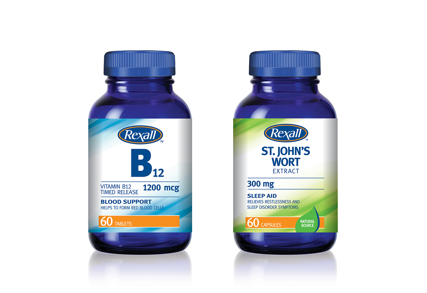
INFORMATION ENRICHED - Rexall's vitamin line required a clean, fresh design system that is easy to shop and quick to implement to over 100 SKUs.


